Mock Content Problems: Length
When designing interfaces, we have to be aware of the length and size of the content. I often see designs that consider ideal, best-case scenarios and overlook real content cases. Then once implemented, only then the issues are evident. This is not measuring, but cutting twice, or thrice.
Take the input field for an email address,
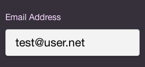
Input in mockup
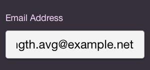
Input in use
There will be users with very short emails, but that doesn’t represent everyone. A quick check using a list of subscribers on-hand shows an average of 22.1 characters. And should I wish to accommodate for the 90th percentile, I am looking at 29 characters. Yet, I often see designs that use really short emails. In practice, the shortened field only makes it difficult for users to verify that their email address is correct.
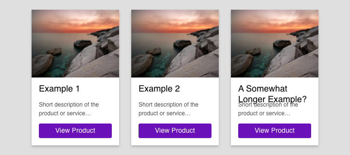
I see the same issue with elements that assume text will always fit on one line, or two. Add to this the lack of specifications to deal with content that overflows. Do we trim it, or let the holding containers grow in size? There are other design constraints that also come into play — such as neatly aligned containers.
List length is also something I’ll see overlooked. Given data to present — is it capped to a limit, or can the return size vary? I’ve seen pagination completely missed on a list of search results. Sometimes, only a few rows are mocked in the table — did the research show that users prefer a very small list?
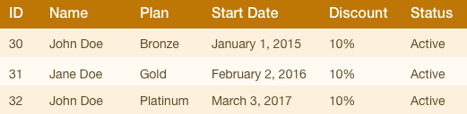
It’s easy to fall into using ideal content when designing tabular data. Picking an ideal value for a column could give off the illusion that there’s more than ample space for the others. Not everyone has the name “John Doe”. Here’s where getting your hands on real data can be beneficial.
Please be mindful of the length and size of the content in designs. It will save the hassle of having to come up with a secondary solution when the real-world says otherwise.